Definition: A scatter diagram is a graph that management can use to track cost and revenue numbers over time. A typical scatter diagram consists of a costs charted on the Y axis and units charted on the X axis. Managers can plot individual costs and units produced over time to see a trend in the overall cost of units produced. In other words, managers can keep track of the per unit cost of producing a product.
What Does Scatter Diagram Mean?
Scatter diagrams are often made periodically throughout the year. For instance, managers usually make a diagram after each month to show the monthly improvements. Scatter plot diagrams are also made each quarter. Here is an example of scatter diagram.
Example
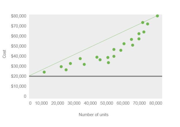
Scatter plot diagrams often show the estimated fixed costs of production as well as the cost behavior line. The fixed costs line is the gray, horizontal line across the graph. You’ll notice that no units are plotted below the fixed cost line. This is because the fixed costs line represents the cost of producing zero units. Producing a single unit will always be above the fixed cost line.
The cost behavior line is the green, diagonal line across the graph. It represents the trend of costs over time. As you can see, this product has an increasing cost trend. Management might try to invest in more automation in the future to lower its variable costs of producing these products. Management could also try to renegotiate with its suppliers to lower the cost of raw materials.
As you can see, the scatter diagram is a powerful tool for management to analyze business performance over time.