Definition: A cost volume profit chart, often abbreviated CVP chart, is a graphical representation of the cost-volume-profit analysis. In other words, it’s a graph that shows the relationship between the cost of units produced and the volume of units produced using fixed costs, total costs, and total sales.
Example
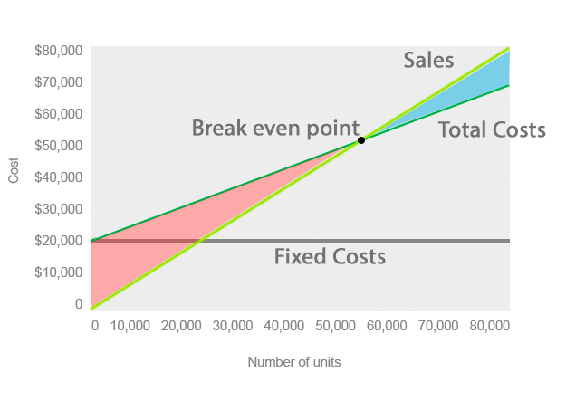
As you can see from the example chart above, the fixed production costs are represented by the solid gray line and are constant across all levels of production. It doesn’t matter if 10 units or 10,000 are produced. The fixed costs will always be the same.
The darker green line represents the total costs of production. This includes fixed and variable costs. As production increases, so does the total production costs.
The light green line represents the total sales of the company. This line assumes that as more units are produced more units are sold. The point where the total costs line crosses the total sales line represents the breakeven point. This point is where revenues from sales equal the total expenses. In other words, this is the point of production where sales revenue will cover the costs of production. The cost volume profit chart calculates the breakeven point in revenues and units. For example, this CVP chart shows a break-even point of $52,000 in revenue and 55,000 units.
What Does Cost Volume Profit (CVP) Chart Mean?
Notice how the area between the sales line and total cost line is red below the break-even and green above it. This represents the loss and profit as sales increase. Managers can use this graph to predict the future losses if projected sales aren’t met. For example, if the company only sells $30,000 of product, its total costs will be approximately $38,000 resulting in an $8,000 loss.
Management can use this information to forecast budget estimates as well as predict future production schedules based on predicted sales.